
Showing posts with label De Atramentis Document Black ink. Show all posts
Showing posts with label De Atramentis Document Black ink. Show all posts
Tuesday, May 14, 2019
Jon Snow
Whatcha gonna do Jon Snow?
 Pen & ink and watercolor on extra weight 270 gsm mixed media paper

Thursday, May 09, 2019
Captain America
Avengers Endgame has come and gone, with the final fate of Captain America in Marvel Universe now known. No spoilers here. Was thinking about doing something related after seeing the movie. And was asked to do a Cap picture. So, decided to try something in watercolor and ink. This is based on a Jack Kirby panel. The results. . .not bad.
 Watercolor & ink 9x12 on 140 lbs block

Sunday, July 15, 2018
Purple Finch
Initially, I was not happy with this but became quite fond of it after it dried. The breast of the finch in the reference photo* was much lighter and mostly white. And while the bird was still wet, it really looked just too dark. I thought I messed it up.
When it dried, however, the colors lightened up (as watercolor does). The addition of few strokes of a white gel pen (plus some splashes of blue paint for good measure) helped the contrast and made for quite a striking composition. I think I like it.
 Watercolor over pen & ink 7x10 on 140 lbs paper

Same picture in pen and ink before the watercolors were applied.
*Photo reference: Birds & Blooms March 2018 (pg 28; Joe Stambaugh)
When it dried, however, the colors lightened up (as watercolor does). The addition of few strokes of a white gel pen (plus some splashes of blue paint for good measure) helped the contrast and made for quite a striking composition. I think I like it.


Same picture in pen and ink before the watercolors were applied.
*Photo reference: Birds & Blooms March 2018 (pg 28; Joe Stambaugh)
Sunday, June 17, 2018
Bad Anatomy Batman
It started as an exercise to see how much ink my new notebook could handle (a decent amount as it turns out). However, it did not turn out well for the Dark Knight's anatomy. Oooph. . I do like the chiaroscuro black and white contrast.

Pen & ink on 98 lbs paper 7x10

Pen & ink on 98 lbs paper 7x10
Tuesday, May 01, 2018
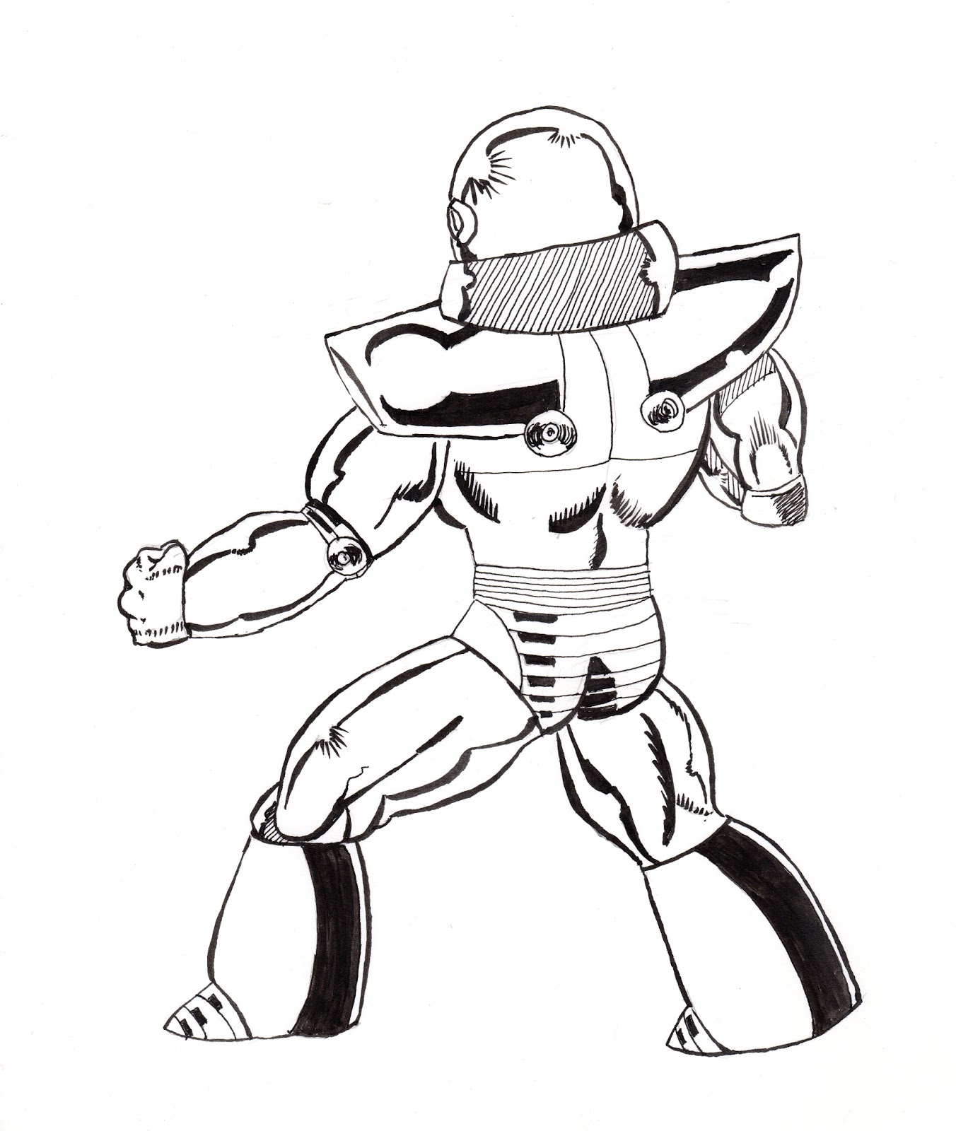
More Blue Devil. . .and the coming of Shockwave!
If Amazo was a C-lister, than Shockwave is a Z-lister. He first appeared in Blue Devil #2 (1984; I must have really liked the lovable loser characters back in the day). At the time I was a big, big fan of the artist Paris Cullins (who launched both Blue Devil in 1984 and Blue Beetle in 1986). I bought any book he was on and his art probably explains why all the Blue Devil love (did not know, but at that time he had recently graduated the DC comics "internship" program).
 So, I found the other Blue Devil pages I mentioned previously. I must have been 17 or 18 when I drew the pages below. There is noticable improvement in them compared to the page I did when I was 14 (for starters, there is an actual attempt to add background). I do not know why I never finished inking, probably because I had no confidence in my ability to ink the buildings. I am not sure if I will go back and trace/ink these three pages but T really liked "the robot" so I made her a "pin-up" of Shockwave. We'll see if I ever finish these pages. It was fun to find these.
 Hey look, there is actual background! Click to embiggen.

Blue Devil ain't doing so hot on this page, he better pick up his game.
 There goes our hero! He rallies back, but how does it end?!?


Blue Devil ain't doing so hot on this page, he better pick up his game.

Wednesday, April 18, 2018
Blue Devil vs Amazo
Recently, I found some old artwork that I did in junior high and high school. Among this treasure trove was some comic book pages that I did when I was about 14. I think this penciled page was part of a submission package that I was going to send into DC comics and never did. The page is a fight between Blue Devil and Amazo (an android who has the combined powers of the Justice League). Neither are particularly famous characters, but back in the day I thought they were cool.
Now that I own a nice portable light box, I decided to trace the original pencils and ink the pages. Below is the my inks over my pencils. Pretty cool.

Here is a scan of the original pencils. Back in the day, I would fill notebooks full of super hero drawings and sketches. Not bad for a 14 year old!

And here is the tracing from the light box. I kept the tracing very loose. It is a bit hard to see.

Now that I own a nice portable light box, I decided to trace the original pencils and ink the pages. Below is the my inks over my pencils. Pretty cool.

Here is a scan of the original pencils. Back in the day, I would fill notebooks full of super hero drawings and sketches. Not bad for a 14 year old!

And here is the tracing from the light box. I kept the tracing very loose. It is a bit hard to see.

Wednesday, April 11, 2018
Old Man Logan
Dystopian Wolverine (Old Man Logan) vs dystopian Hulk (Maestro), but neither is from the same dystopian future as the other. Such is life in the Marvel Universe.
Originally I was going to lay watercolor over these inks, but have decided not to, at least for now. This is based on a panel by awesome Brazilian artist, Mike Deodato, from Old Man Logan #30.
 Pen & ink on 90 lbs paper 11x15
 Started with a rough pencil sketch.
 Decided to do all the details in ink. Cross-hatching is fun!
 More details. . .but no trees yet. . .
Originally I was going to lay watercolor over these inks, but have decided not to, at least for now. This is based on a panel by awesome Brazilian artist, Mike Deodato, from Old Man Logan #30.


Sunday, July 16, 2017
Washington Valley Reservoir
I have no idea what this building is or what its purpose is, but I wonder about it every time I go hiking around the Washington Valley Reservoir. It probably had something to do with controlling the dam of the west branch of the Middle Brook (the brown berm in the mid-ground) that created the reservoir.
What ever its function was, I think it is pretty cool. And having just finished Mark Lawrence's second trilogy set in the Broken Empire (think violent post-apocalyptic Game of Thrones), I imagine the building holds a long metal rung ladder that goes deep below the reservoir leading to a bunker where Builder-ghosts seek to influence the events of the Red Queen's War.
 Watercolor 11 x 8.5 on heavy weight paper 270 gsm


What ever its function was, I think it is pretty cool. And having just finished Mark Lawrence's second trilogy set in the Broken Empire (think violent post-apocalyptic Game of Thrones), I imagine the building holds a long metal rung ladder that goes deep below the reservoir leading to a bunker where Builder-ghosts seek to influence the events of the Red Queen's War.


Tuesday, July 11, 2017
Playing at Comics -- Page Deux
Like the amplifier for a Spinal Tap guitar, I have cranked (the cheese on) this one to 11. Truly, I blame Cone for the increased Cheese Factor, when he threw the gauntlet down with his "head 'sploding' review of page 1. It was inevitable really.
Continuing the story of our unnamed heroine from Page 1, we learn a bit more about her past, but not much more about her (intrigued? how could you not be with all that cheesy goodnes?). Alas I think, this will be it for now
 Page 2 (click to embiggin')
 Unlettered art Page 2 (watercolor, pen and ink)
 Pen and Ink
Continuing the story of our unnamed heroine from Page 1, we learn a bit more about her past, but not much more about her (intrigued? how could you not be with all that cheesy goodnes?). Alas I think, this will be it for now


Sunday, May 21, 2017
Playing at comics
Been inspired by Tyler Jenkins watercolor-based art in Grass Kings (and before that Snow Blind) and wanted to try something similar. But do not have a story right now so I took two random images from Country Magazine and combined them into paneled art. Then added some words to make a "story" via Microsoft Publications. Let's see where this all goes. . .
 Page 1? (Will there be a Page 2?)

Unlettered art -- watercolor, pen and ink on paper (the paper was not made for watercolor, so it has buckled due to the water washes)
 Pen and ink


Unlettered art -- watercolor, pen and ink on paper (the paper was not made for watercolor, so it has buckled due to the water washes)

Friday, May 19, 2017


Tuesday, July 05, 2016
Vacation in 2 Parts - Deception Pass Bridge
From Seattle we drove north so we could go hiking and whale watching (for Orcas!!!). On the drive up, we called an audible and took the car ferry at Mukilteo to Whidbey Island (billed as the "shortest distance to far away"). We drove north on the Cascade Loop Rt 20. This is how we found Deception Pass Park and its famous namesake bridge that spans the Puget Sound (180 feet above the water). We hiked down to the north beach in the park with this incredible view of the bridge. I think the painting of the bridge is the best (and my most favorite) thing I have done in many, many years.


watercolor pen & ink on 110 lbs paper (PS)
We came back the next day to hike the trails in the park and came back to the north beach. This is a view to the left of the bridge. You can see Fildalgo island on the right that connects to Whidbey via the Deception Pass Bridge.

watercolor pen & ink on 5.5X17 paper
And for those of you scoring at home, this is my 350th post of this blog!!
And for those of you scoring at home, this is my 350th post of this blog!!
Friday, July 01, 2016
Vacation in 2 Parts - The Seattle Area
Greensboro, NC had Biscuitville but Seattle had the Biscuit Bitch!! And anyone who knows me, knows I love me some biscuits (even as much as I love Triple D). So when T over heard some of her fellow conference goers singing its praises (and they were down home southern to boot), well you know I had to go. We get there at 10:30 am on a Friday and there is a 45 min wait for the food (but we had already ordered), so we waited. Below is a quick sketch of the scene outside of the crowd. It actually only took 30 minutes but man oh man was it worth it. The biscuits were large and fluffy and delicious and smothered in country gravy and eggs. Check out their Instagram to see pictures of the food. If you are in Seattle and have an hour for breakfast. . .go there.
 watercolor pen & ink 5.5x8.5 on paper
On Father's Day we took the ferry from Seattle to Bainbridge Island looking for some adventure, shopping and a nature walk. Well, the "nature" walk was not much to blog about, although it did end with the view below, but the rest of the day walking around was very cool. There was a festival going on, and lots of local restaurants and shops had little tents selling wares and food. It ended up being a really cool day.
 watercolor pen & ink 5.5x17 on paper

On Father's Day we took the ferry from Seattle to Bainbridge Island looking for some adventure, shopping and a nature walk. Well, the "nature" walk was not much to blog about, although it did end with the view below, but the rest of the day walking around was very cool. There was a festival going on, and lots of local restaurants and shops had little tents selling wares and food. It ended up being a really cool day.

Wednesday, April 27, 2016
The Perfect Sketch Book
I was so happy to come back from Vancouver to see that my Perfect Sketchbook (PS) had arrived!! T supported the Indiegogo for me as a Christmas gift (so Christmas in April, Huzzah!!!) and the books are just gorgeous. They are made with cold-pressed, 200 GSM Fabriano Artistico® watercolor paper, so the book is made for heavy washes.
 Watercolor, pen & ink 6.9 x 9.8 inches on110 lbs paper
I did not know what to draw/paint/sketch as the first picture in my PS, so I fell back to an old favorite. . .my neighbor's tree. This must be the 8th or 9th drawing of this tree I have done in the past few years.
The book handles the multiple washes well and allowed me to layer colors. I started the ink drawing with a dip nib (Nikko G) and after the ink dried laid down the colors. The paper was robust enough to go over the dried paints with another pen to enhance the line work. All in all, my first experience was very pleasant and I cannot wait until I get some time to really play with the PS.

I did not know what to draw/paint/sketch as the first picture in my PS, so I fell back to an old favorite. . .my neighbor's tree. This must be the 8th or 9th drawing of this tree I have done in the past few years.
The book handles the multiple washes well and allowed me to layer colors. I started the ink drawing with a dip nib (Nikko G) and after the ink dried laid down the colors. The paper was robust enough to go over the dried paints with another pen to enhance the line work. All in all, my first experience was very pleasant and I cannot wait until I get some time to really play with the PS.
Wednesday, March 16, 2016
Old Man
Worn, weathered faces are so interesting to draw. Each line, tells a unique story.
 Watercolor, pen & ink on paper
"I have been bent and broken, but - I hope -
into a better shape."
Great Expectations
Charles Dickens

Sunday, February 14, 2016
InCoWriMo
Back in ancient times when I was in college, I used to write letters quite frequently. Especially during the summer months when most of my friends had scattered to the four winds. I did not have fancy fountain pens or even a calligraphy set, but I did have my cartooning. I would add little drawings through out the letter, making each letter something unique. My roommate Cone and I would send letters back and forth, each trying to one up each other with our drawings of Calvin & Hobbes, Pooh Bear, Disney characters or our own creations. My favorite was when he put Stupendous Man on the envelope and commanded the postman to do his "nefarious bidding" (yeah, I have stolen that). Then, with the advent of email, cell phones, text messages and other social media, I just. . .stopped. Which is sad, because, who does not like getting a hand written letter? In early January I learned about something called InCoWriMo (pronounced: ink-o -rye-mo; International Correspondance Writing Month) which urges people to handwrite one letter per day in the month of February. And it made me remember how much I enjoyed writing and getting letters, so I decided to give it a go. I do not know if I can do 29 letters done this month, but am going to try. Below is the letter I sent to T for Valentine's Day (there was also a handwritten note, but I am not posting that ;-).
 Pilot Custom 912, watercolor on Bristol paper 9x12

Subscribe to:
Posts (Atom)